Redesign of a website selling drones

Task:
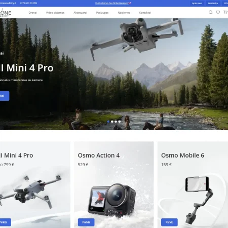
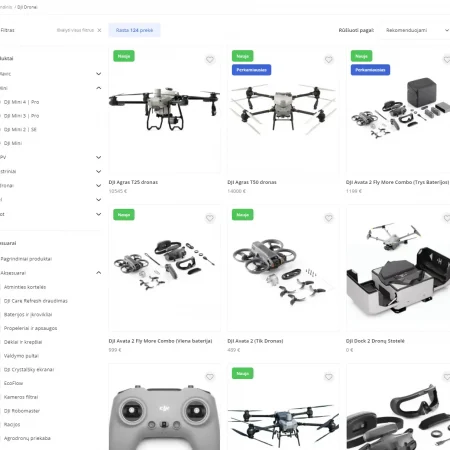
The client had an already working website selling drones and needed a complete website redesign. The key requirements were speed of performance, simple but attractive animations, and a functional product filter on the store page
Solution:
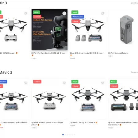
The client provided us with Figma with a ready-made design, but without animations and without a clear understanding of how the store filters worked. A system of product filters was developed for easy user navigation through the store, and minimalistic animations were implemented to complement the pleasant visual component of the site, while not distracting from the content.
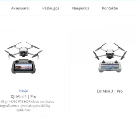
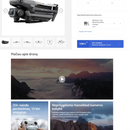
To edit the site’s content was integrated plugin ACF, as well as to manage the main content of the site was created a separate convenient section in the admin panel. In the site header, a multi-level menu related to the store filters was implemented. And on the product page, dynamictiled fields were created combining images and text.
In addition to the store itself, the site contained many informational sections such as warranty interpretation, product insurance description, help section, blog, and tutorials.
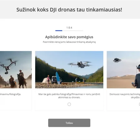
The site also included an interactive quiz, where the user would get a hint on which model would suit their needs depending on their chosen answers.
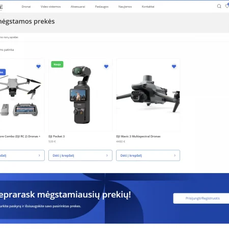
The user’s membership area has also been styled to include their details, and orders, as well as a handy and functional Wishlist.
SEO weight of the site was important to the client, so many pages such as FAQ were made accordingly so that each of them would give weight to the site in search engine results.
In total:
As a result of our work, the client received a fresh website with excellent optimization and a functional and convenient store.
